'Amber Glow In Autumn's Gray Dusk' by HeartsandHandsUnited
Items from the talented friends of Team Hearts and Hands United
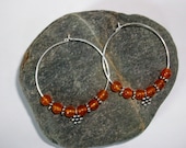
 Fall dark Olive and... $8.00 |  Beautiful Brown Rou... $10.75 |  Silver and black sw... $75.00 | 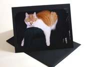 Are you talking to ... $3.50 |
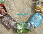
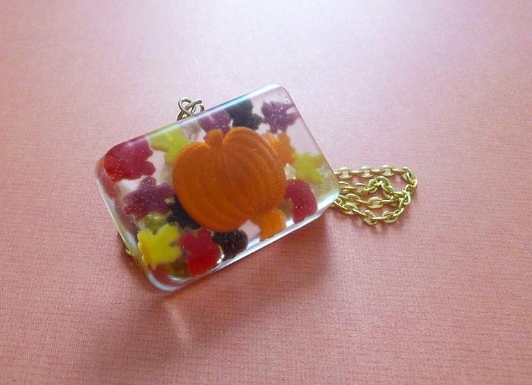
 Jewel Bright Glass ... $20.00 | 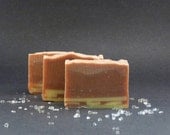 Chai Tea - Shea But... $4.50 | 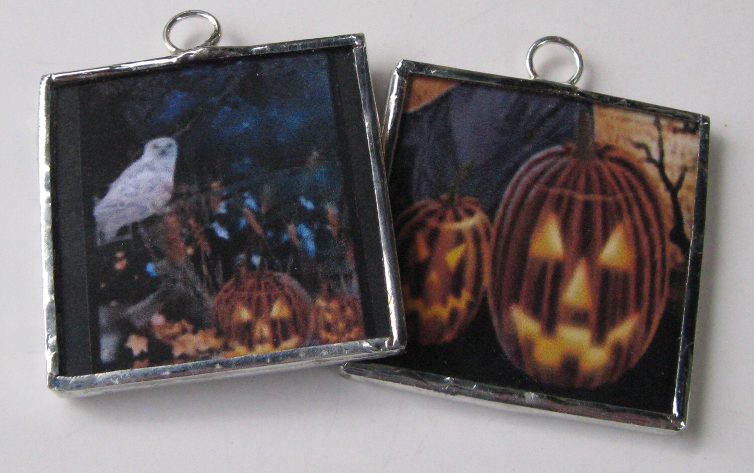 Two Sided Soldered ... $12.00 | 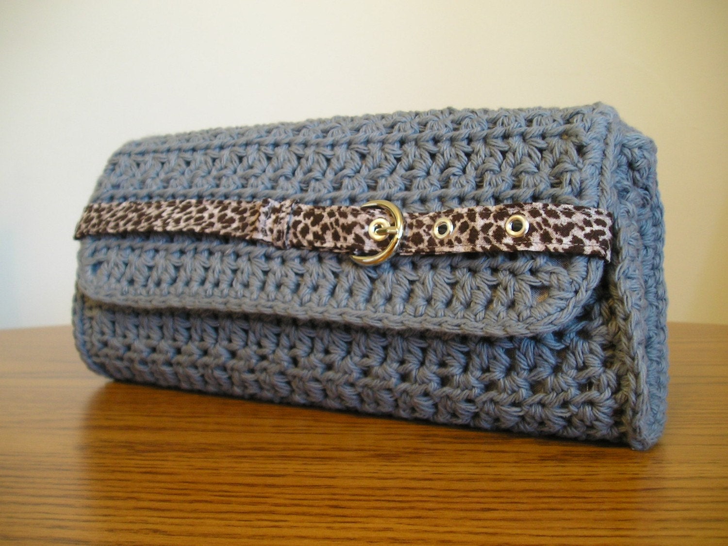 Steel blue and leop... $30.00 |
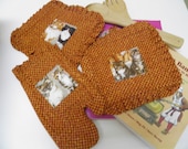 Kitchen Set / Oven ... $26.00 | 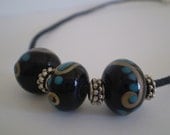 Lampwork Bead Neckl... $7.00 | 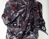 Grey Silk Nuno Felt... $150.00 | 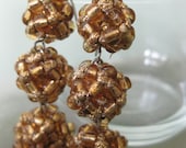 Triple Threat- Dang... $18.00 |
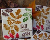
 Dead Goth Bag (Alic... $59.37 | 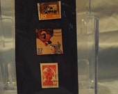 Recycled Postage St... $1.50 | 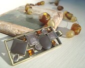 Cream and Amber Col... $30.00 | 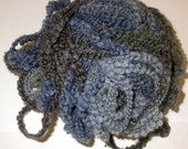 Destash-Magical Mys... $6.00 |
Generated using Treasury HTML code generator by Whale Shark Websites.